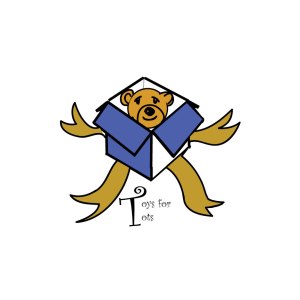
Client name: Toys for Tots Foundation
Research:
The site (http://www.toysfortots.org/Default.aspx)
Toys for tots mission is to “is to collect new, unwrapped toys during October, November and December each year, and distribute those toys as Christmas gifts to less fortunate children in the community in which the campaign is conducted.” The Foundation started in 1995 with the approval of Secretary of Defense, the Marine Corps Reserve started its mission. And its life span, the Marine Corps Toys for Tots program distributed over 469 million toys to over 216 million less fortunate children. It’s logo to me seemed very weak and the shade of red they used was not good in my opinion.
Goal:
The primary goal of Toys for Tots is to deliver, through a new toy at Christmas, a message of hope to less fortunate youngsters that will assist them in becoming responsible, productive, patriotic citizens.
Early Design:
My Early design was simple enough, an open box. But a box alone doesn’t work. I needed an object that symbolizes happiness and joy for children. The object hit me while I was watching a history program about Teddy Roosevelt. A teddy bear symbolized happiness and joy. So the easy part was over, but the fact of during so was the hard part.
I drew a few different versions, but only this one was the stood out. It was simple and it was my first time using a tablet. Which I take back what I said earlier about being the hard part.
Challenges:
To be fair about things. Doing this was a big challenge all together. My laptop died halfway through this undertaking, with which I’m sorry I can show a lot of my early designs etc…(I know I should have backed up the files) Having to learn a new program was a bit annoying and I wanted to smash my head against the wall a few times. I couldn’t properly color my logo design so that color in my logo design, that also set me back a little. But after awhile it got easier and started to click. There are still things I need to learn like most things, but lack of time and personal matters came in.
.
I really liked this version better then the final version. This one showing the logos of corporate partners. But because I used Photoshop to put it in the logos, they had a very odd outline when I brought the file into Illustrator. (HATE ILLUSTRATOR) moving onto the final part
Final Products:
Now going onto the last part of this “Blog” or “Case study” for my poster, there were two different versions. Version one can be seen above. The final final version can be seen here.
This version does lack the logos of the corporate partners but it gets the job done in my book. I tried to get closed to the same shade of blue as the site, but old saying” work with what you got? I moved the stars around to make up for the dead space where others were. The stars sizes were increased and the photos of the children were moved as well to show more of their happy faces. Now for the logo itself.
Now where some shifting things like the bear head and the ribbons, it came together quite well. Thus, the shade of brown wasn’t what I wanted it to be but it worked. Now where the white spaces, I left it like that when I moved onto the poster. It gives the feeling of depth, shadow and light. And the font itself looked very childish and it fit perfectly . It was silly and easy. Making the size of the T large to shorten the type itself.


